soul.com
soul.com a learning-in-action community
A layout is right when it shows that someone understood the text: what it says, what matters most, how the ideas relate.
Typography is how we show that understanding. Hierarchy, rhythm and emphasis follow the meaning of the words; they do not decorate them. Read the text first, find the one idea a reader has to take away, and give it the most weight on the page.
When I am working on a problem, I never think about beauty. I think only how to solve the problem. But when I have finished, if the solution is not beautiful, I know it is wrong.
From a single candle to fireworks. The grid, the two typefaces and the label stay the same; only the amount of light changes.
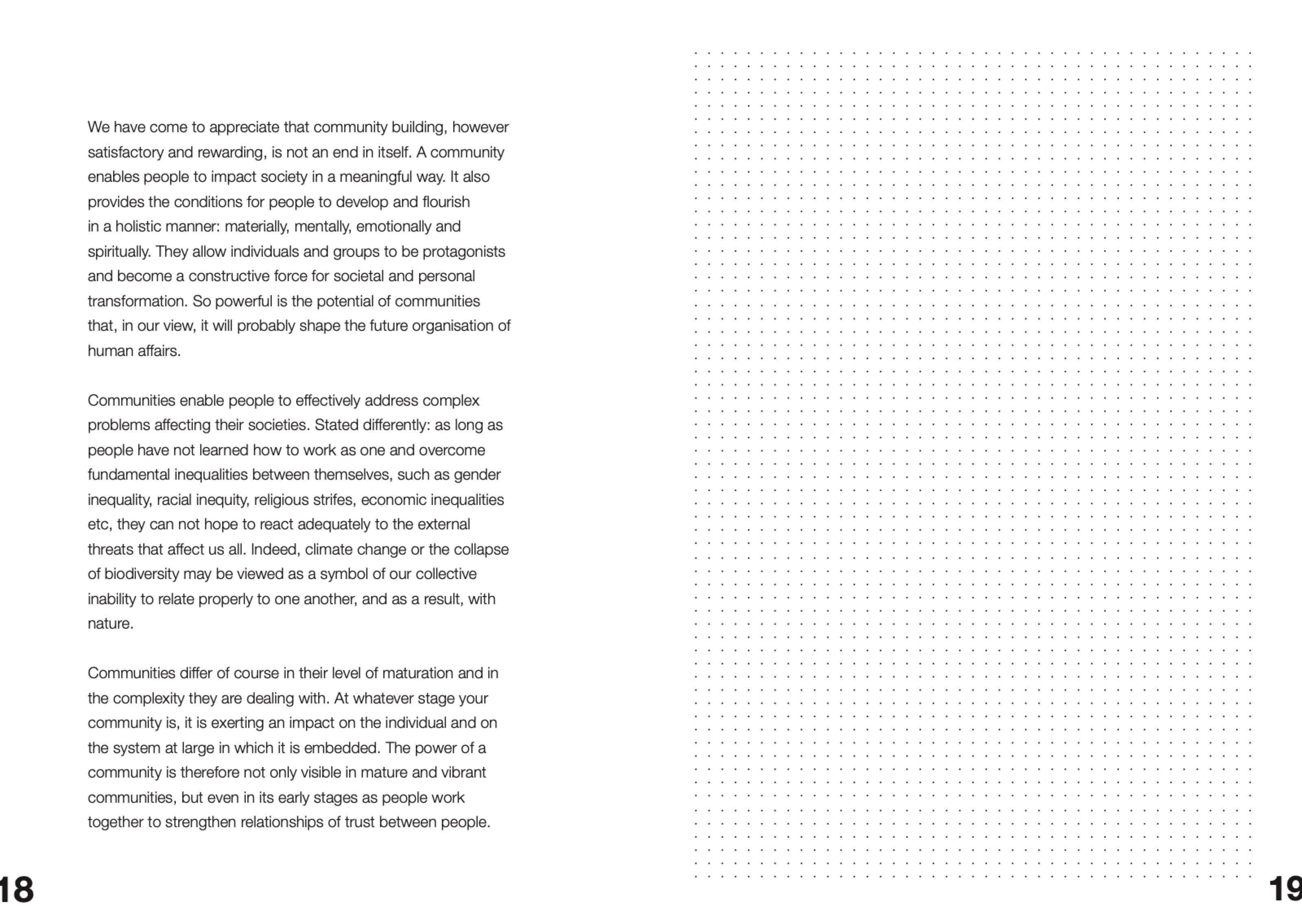

Community is one of the highest forms of human organisation. The quality of relationships determines the quality of outcomes.
Conceptual framework, foundational documents
- human being
- Human beings are fundamentally relational. Identity, agency, and responsibility emerge in relationship, not in isolation.
- change
- Transformation is primarily cultural and relational before it is structural or technical. It requires patience, reliability, and the willingness to stay with tension.
- hypothesis
- An organisation needs a soul, and it needs to organise itself as a community.
- values
- trust, hope, solidarity, unity, justice, service, excellence, human dignity, responsibility: guiding principles, not performance indicators.
- three spaces
- soul for organizations, soul for society, soul for humans, with a community of practitioners running through all three.
- the commons
- Not what we know, but how we continuously generate, apply, and pass on knowledge together. This design system is part of it.
voice
- lowercase. The name is always soul.com. Labels, buttons and navigation are lowercase.
- Short phrases with verbs: reshape the world, unlock the will to act, awake the community spirit, creating a new mind.
- We, to a peer. Honest, no hype, no superlatives, no exclamation marks.
- Propositions, not claims. Say what we believe and where it might break.
- Plain, precise sentences. “This is not about control. It is about transparency.”
- Quotes carry context. Always attribute them.
- No emoji, no decorative icons.
The logotype is typeset, never drawn: soul.com in lowercase, in the opposite face of the page.
subject: Foundational documents
date: 4 September 2026documents: Garamond 22 on a yellow box
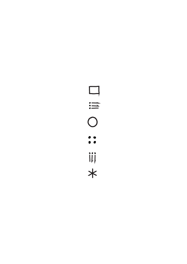
The drawn O. for covers and openers; the small soul mark and favicon for screens; the hand-drawn icons as markers next to text. Use the files as they are. Each link opens the file; save it from there.


two voices, in opposites
Helvetica Neue states; EB Garamond reflects. The logotype takes the opposite face of the page.
- value word
- Helvetica Neue Regular 120pt, normal tracking, lowercase
- verb line
- Regular 30pt, same left and right edge
- label
- Regular 15pt in an ink box, 1.4em high, text in the ground colour
- subline
- EB Garamond 15/18pt, tight under the label
- scale
- doubling: 15 › 30 › 60 › 120 › 240 and 10 › 20 › 40 › 80 › 160; web 18 › 36 › 72 › 144
hope
reading
creating a new mind
cycles of learning where action, reflection and consultation are the three main phases
How can we make a greater impact on the world through our work? And how can we become better at what we do?
Nine rules, each shown, none just stated.
01
The label takes the colour of the ground.
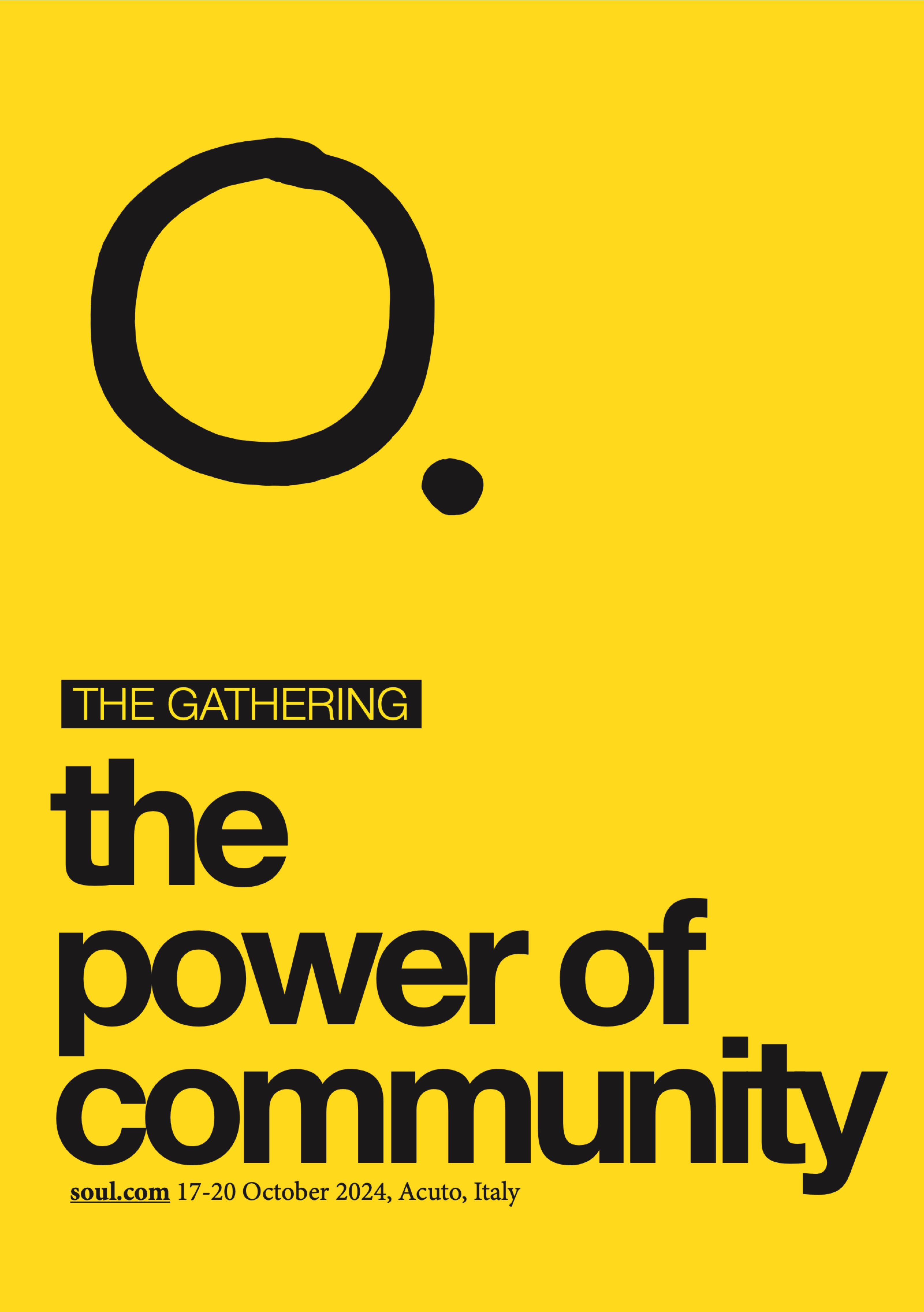
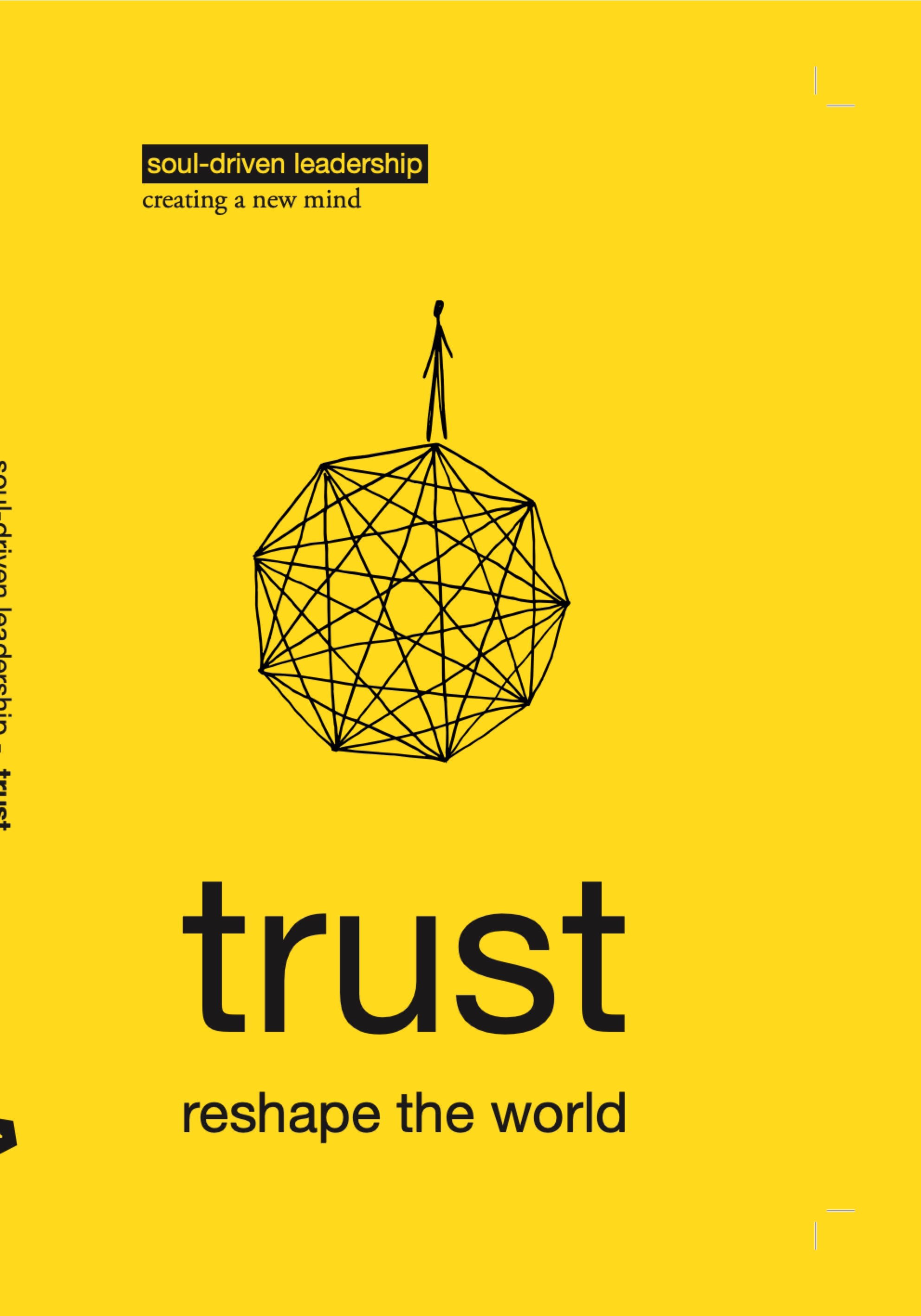
The box is cut out of the surface. Source: trust cover.
02
The one word stays Regular.
Size carries it; weight and tight tracking only shout.
03
Stay on the doubling scale.
Title and verb line two steps apart (120 › 30).
04
Two voices, in opposites.
Helvetica Neue names; EB Garamond reflects.
05
Emphasise one word, with a line.
Underline the key word, same colour and weight. Source: deck agenda.
06
Names stay lowercase.
soul.com, always. Series and labels too.
07
The box hugs the words.
1.4em high, 0.2em each side, square. A highlight, not a button.
08
Lettering is drawn, not typed.
Use the exact lettered words; never a handwriting font.
09
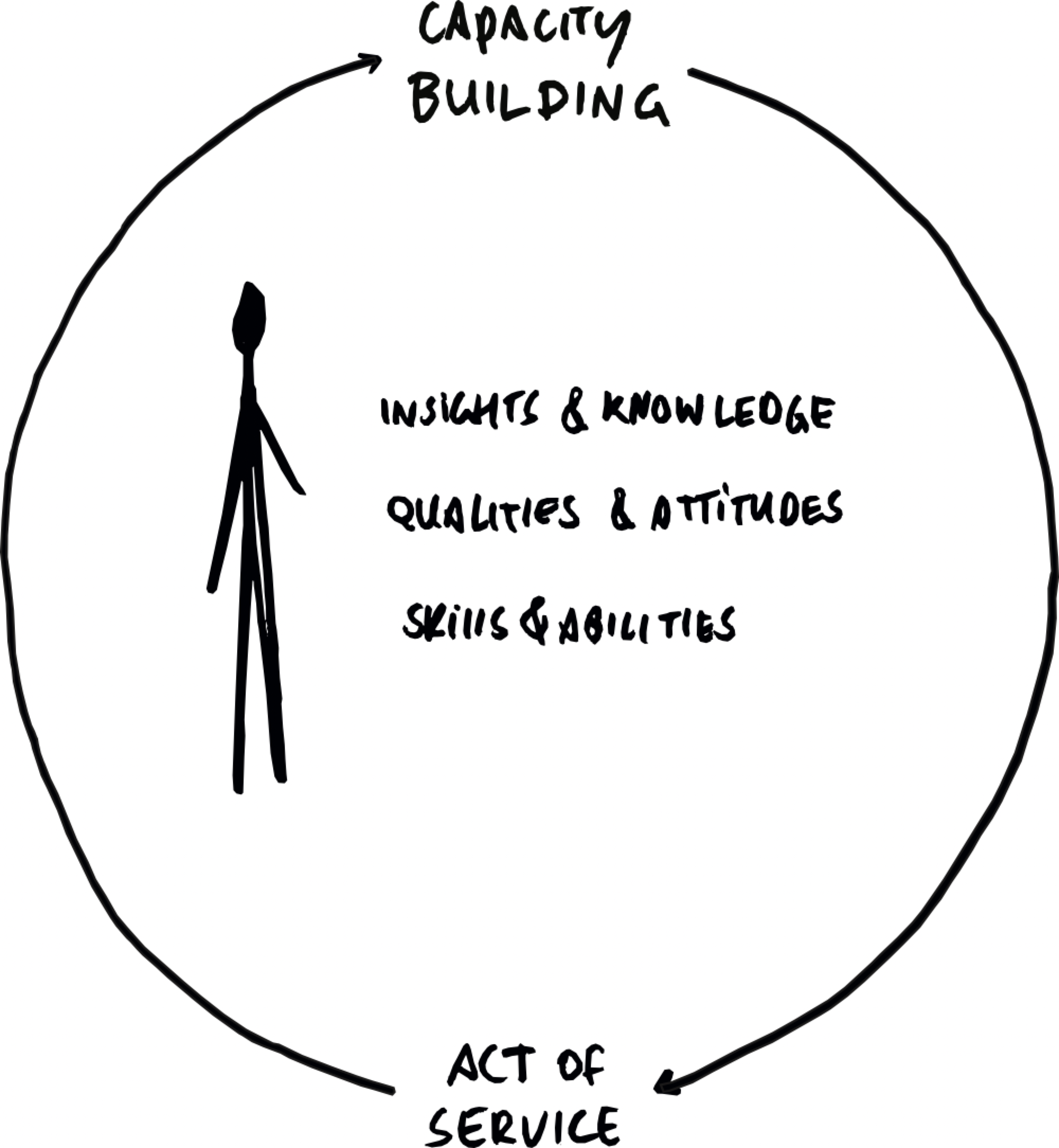
A shape is the drawing itself.
Never rebuilt as geometry, however close it looks.
creating a new mind
The label is cut out of the ground: its text takes the colour of the page it sits on.
Yellow on a yellow cover, white on paper. One box per line, 1.4em high, 0.2em each side, square. On ink the box turns yellow and its text takes the dark ground.
#FFDD00 trust · #FFC40C hope · #FBAA19 solidarity · #F7901E unity · #F47721 justice · #F15A22 service · #ED1C24 excellence. Ink #151515. Human dignity and responsibility carry no colour: set them in type only.
A page has one of four grounds: white, yellow, black or dotted. Nothing in between, in print, on screen and in slides.
No light greys, no tints, no gradients. Value colours (hope to excellence) are fields for their own book or spread, not general backgrounds.
The grid is felt, never drawn. Then one element breaks it, on purpose.
One module: 18px, the body size. Columns, gutters and spacing are multiples of it: 36, 72, 108. Align text to columns and baselines; line up the edges of drawings, labels and images with each other. A single word may bleed off the page, a drawing may cross two columns, a label may sit off its column. Two breaks become noise.
space-unit 18 · gap 36–40 · section 108. Corners square; a circle only where a drawing is a circle.
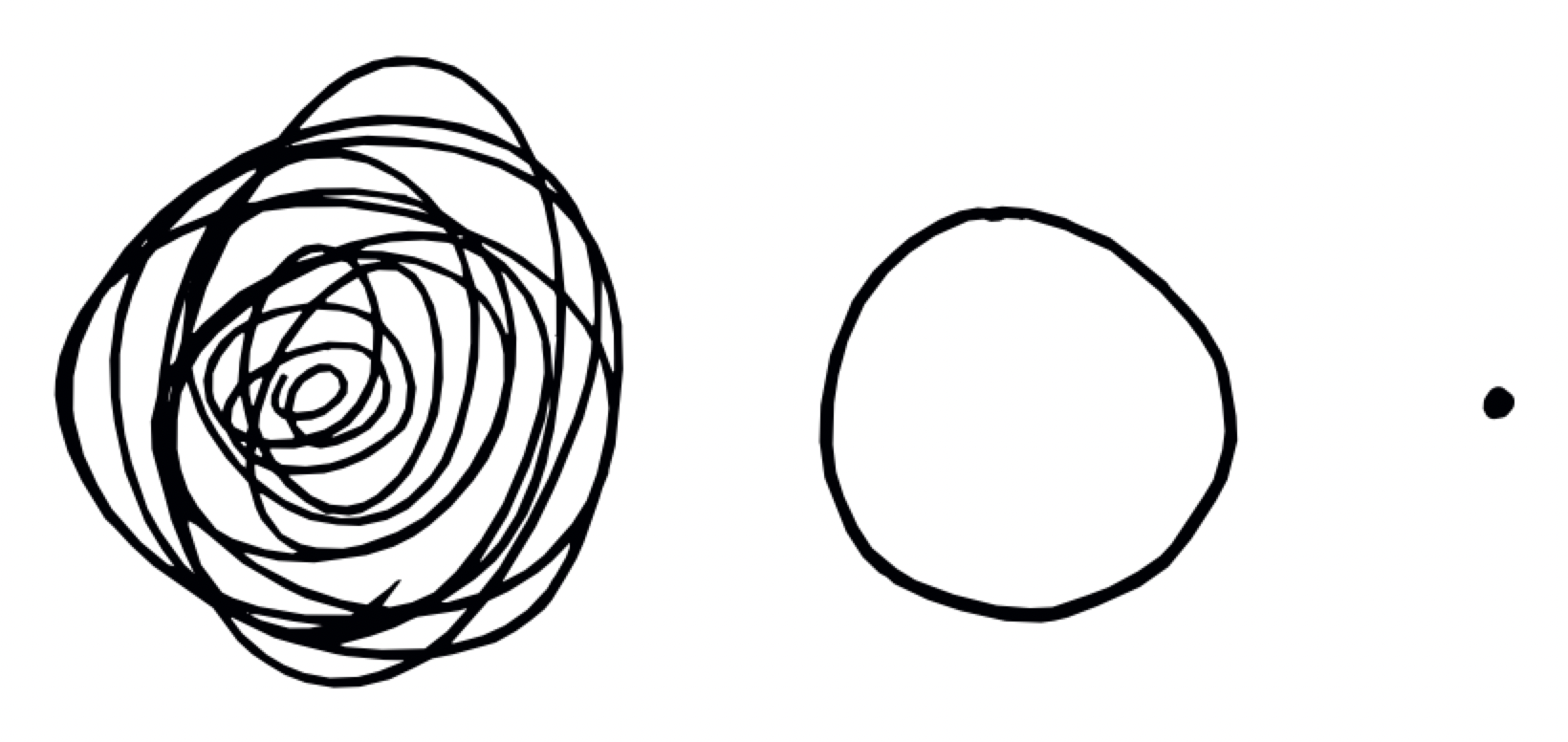
Every circle, point and model is the drawing itself, never a redraw.
Hand-drawn, wiggly, uniform line, made from circle, triangle, spiral, square and the small figure. A vector rebuild can be geometrically right and still lose the hand. Hand lettering inside a model is redrawn per language, never set in a font.
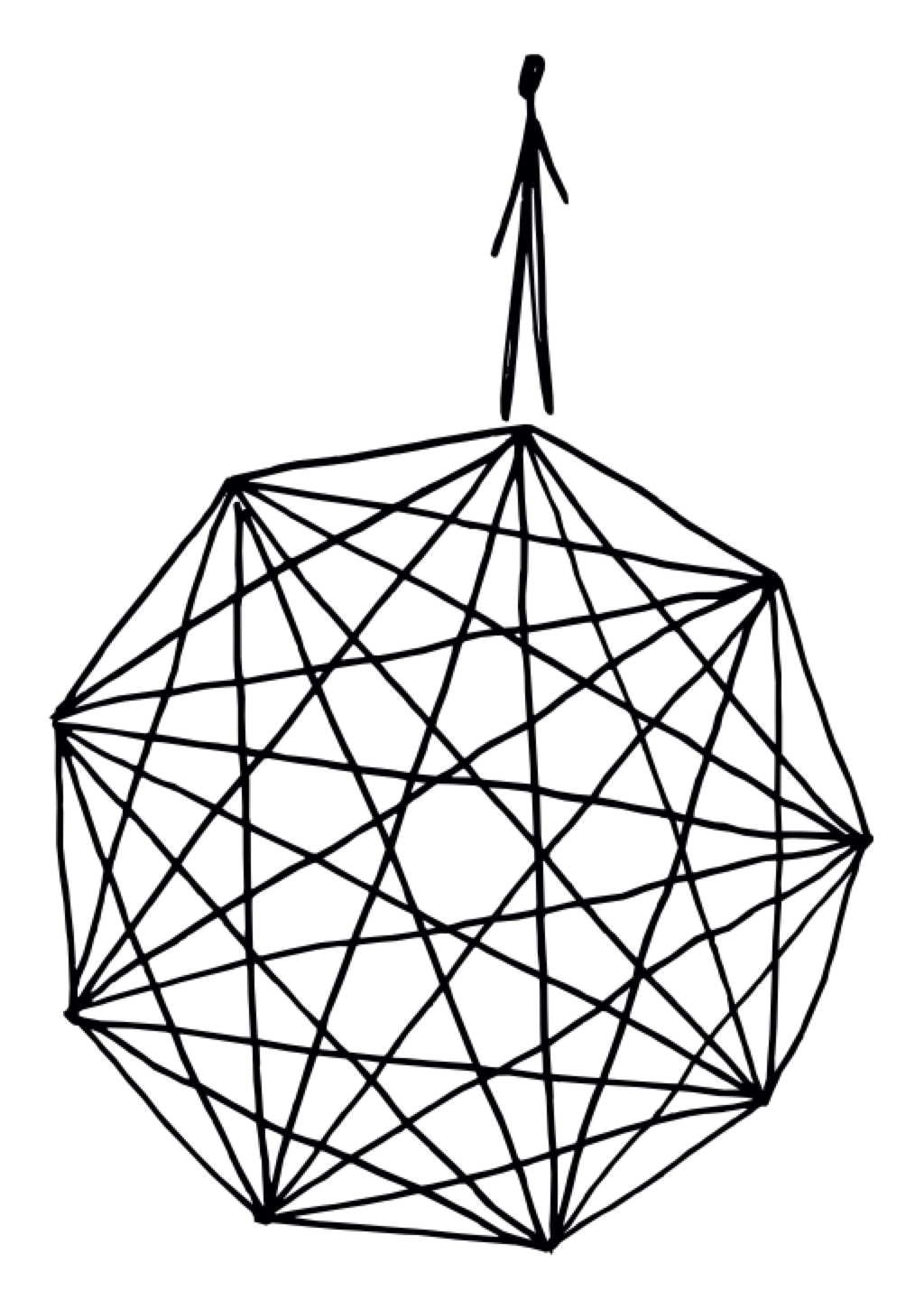
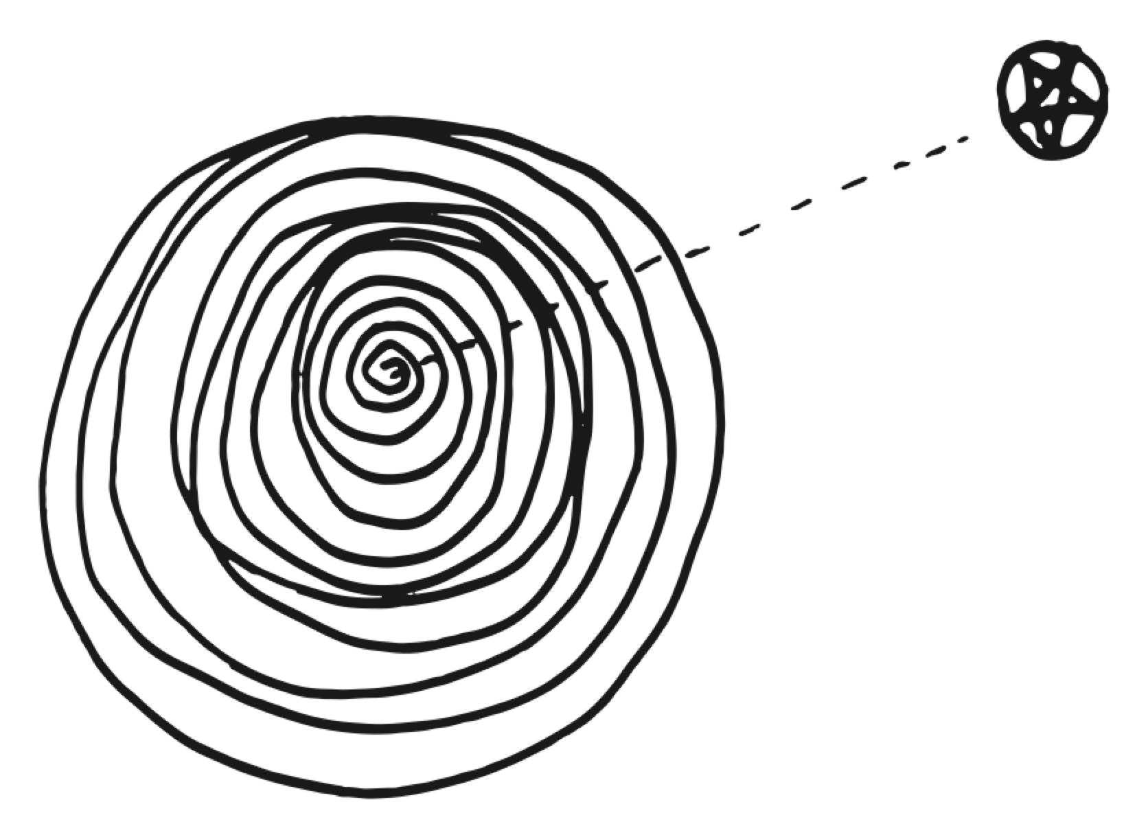

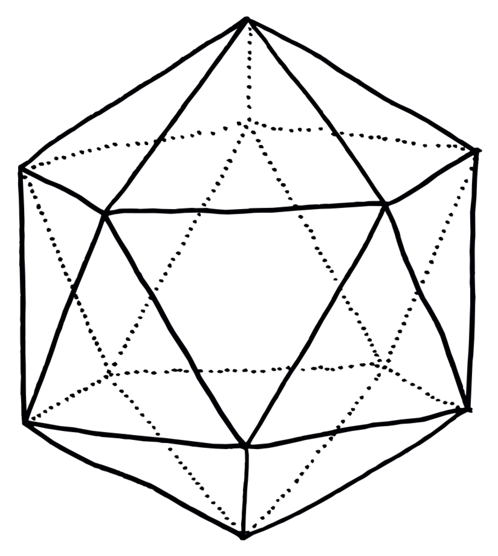
Twenty models, black line on white, PNG. Multiply them onto yellow or a value colour; never redraw, trace or clean them up.
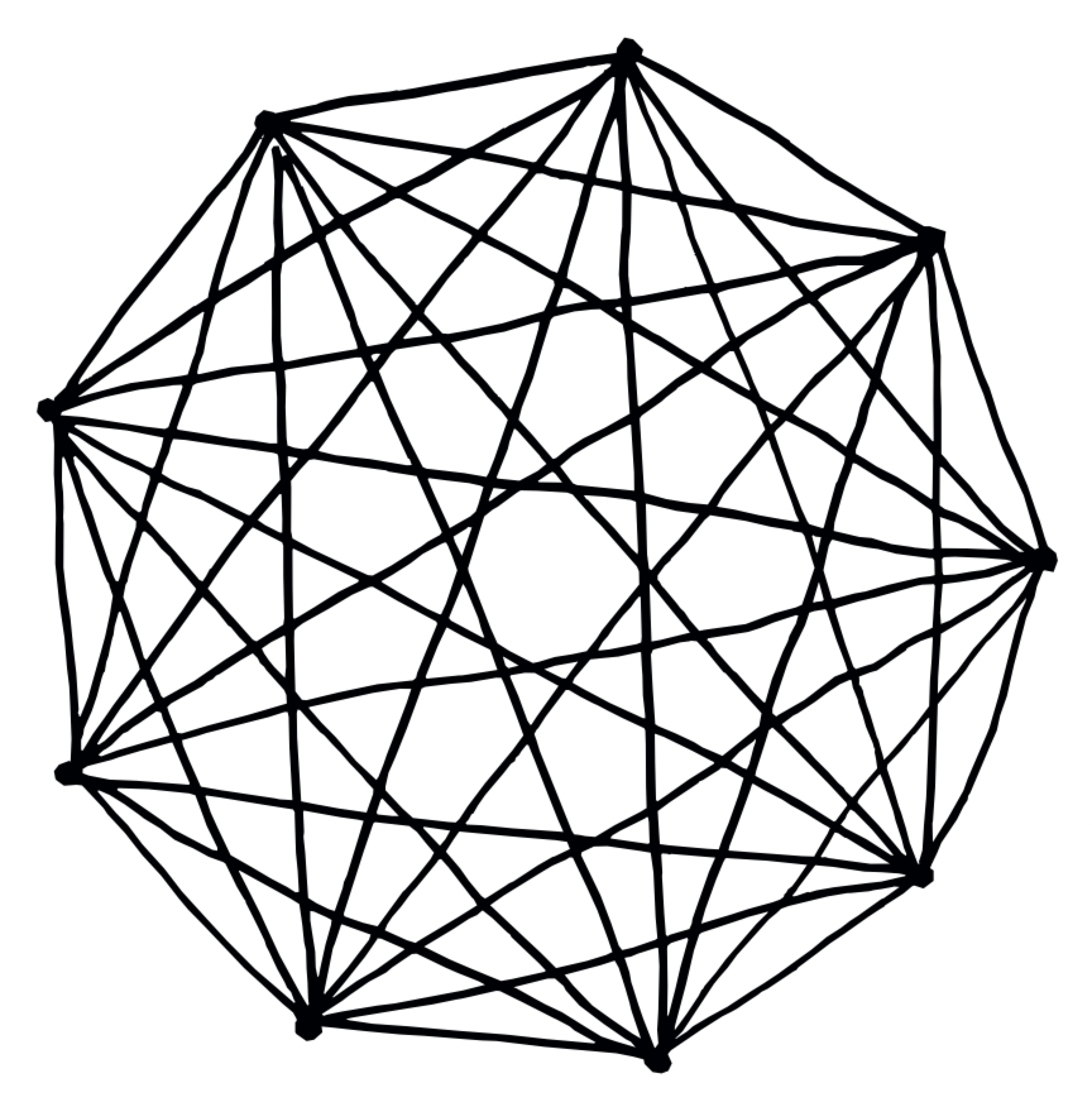
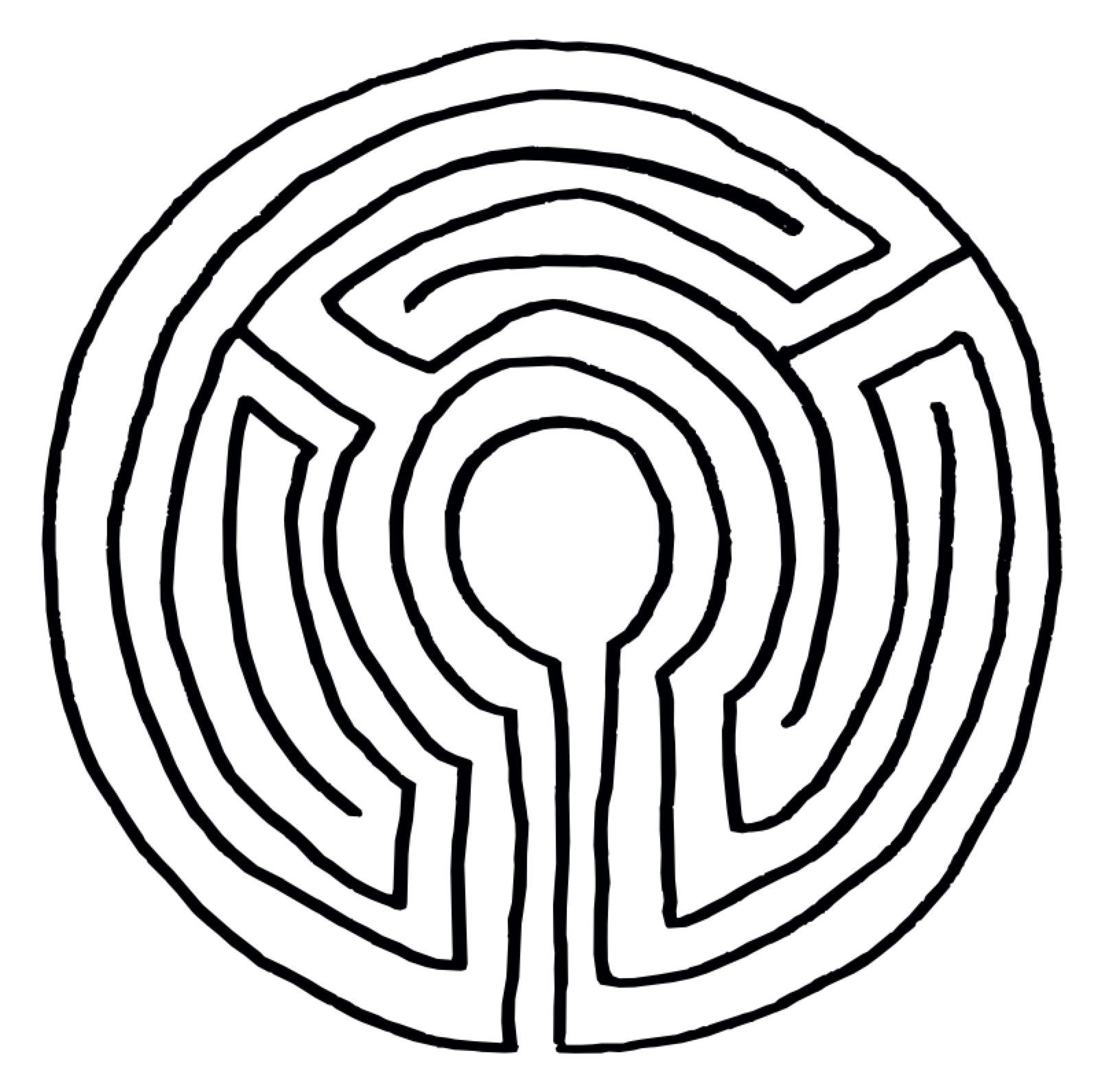
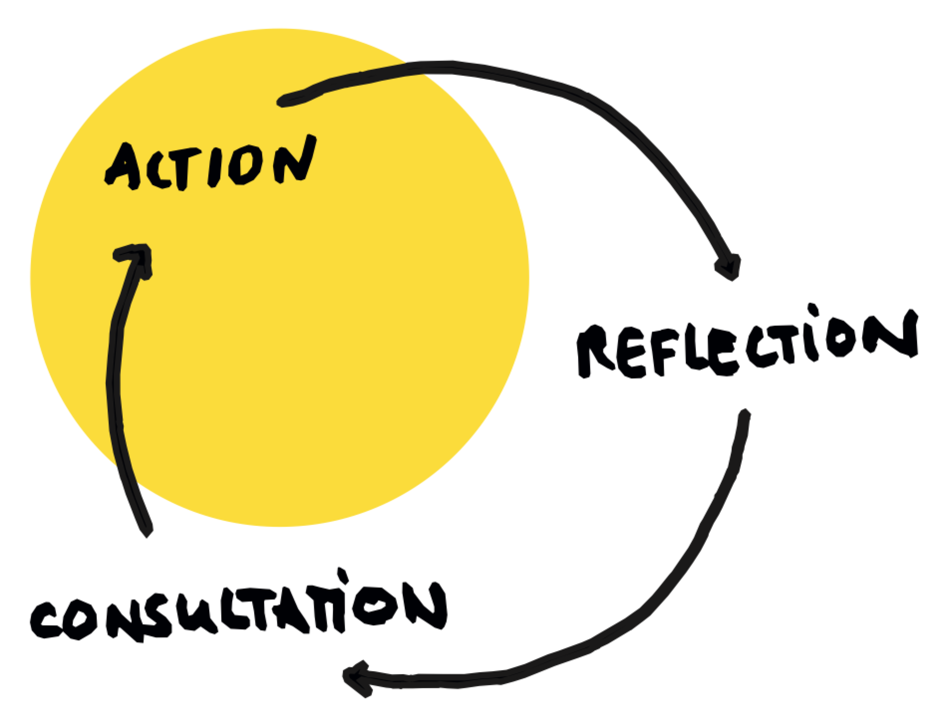
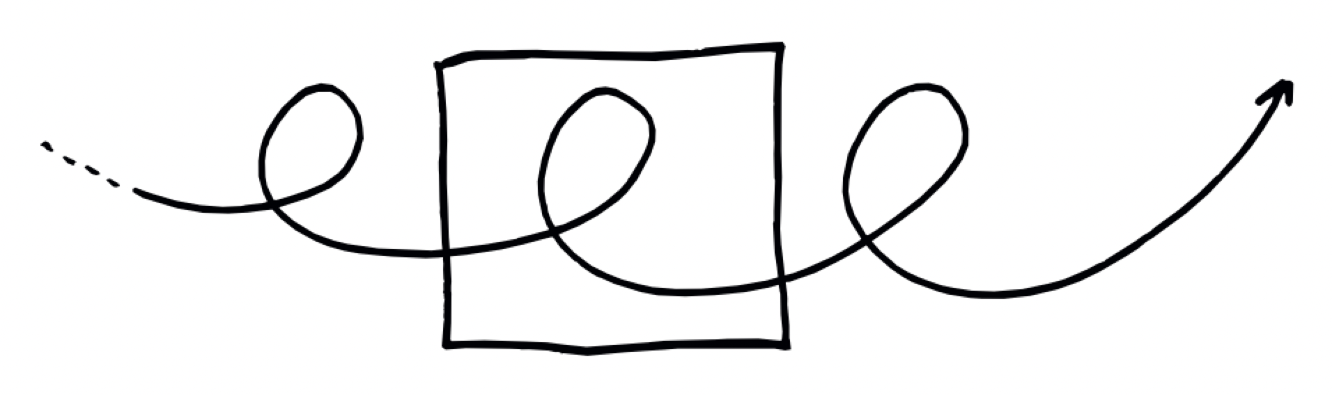
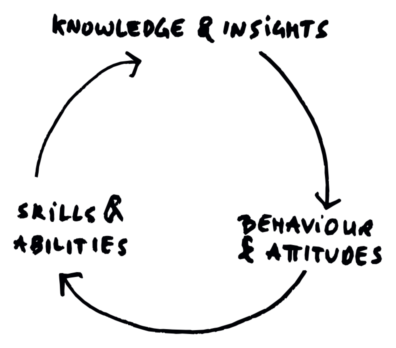
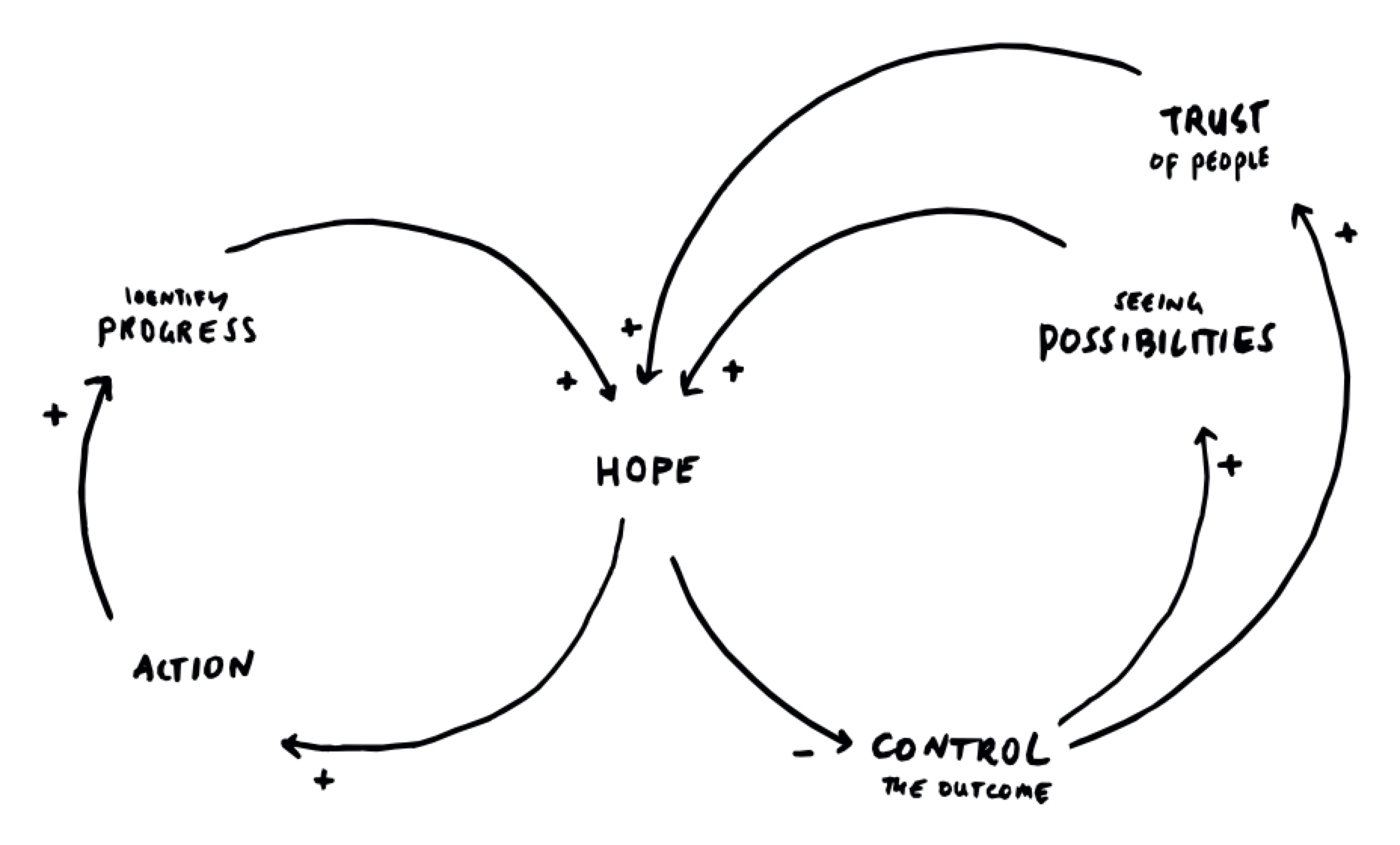
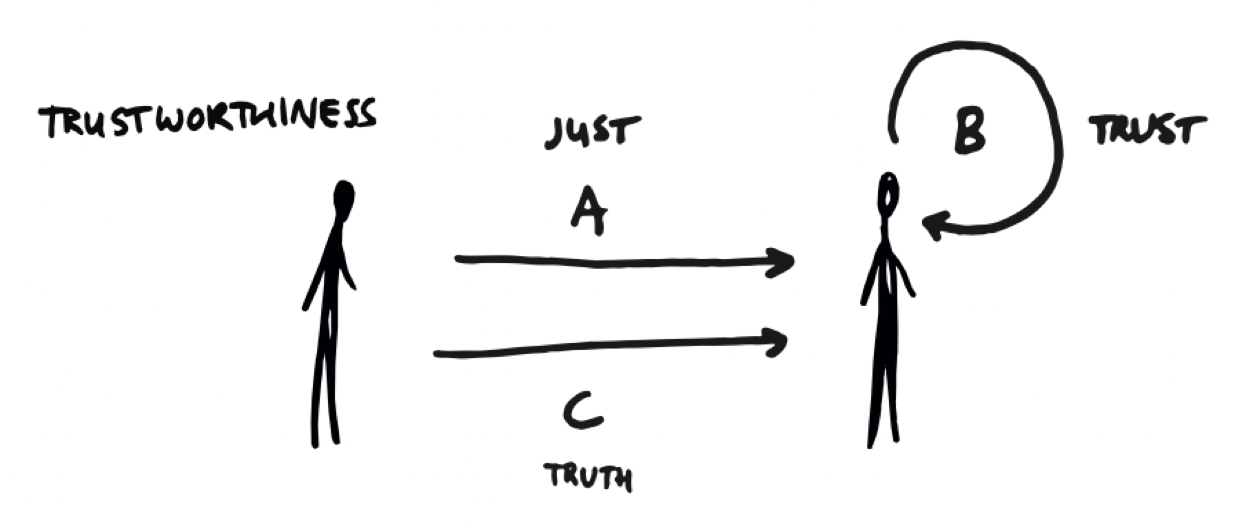
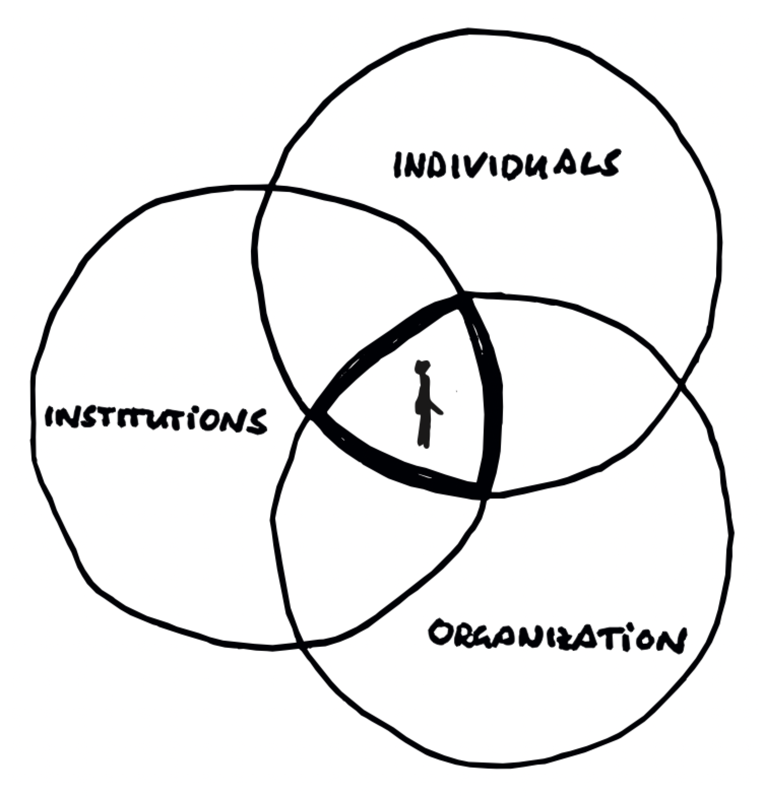


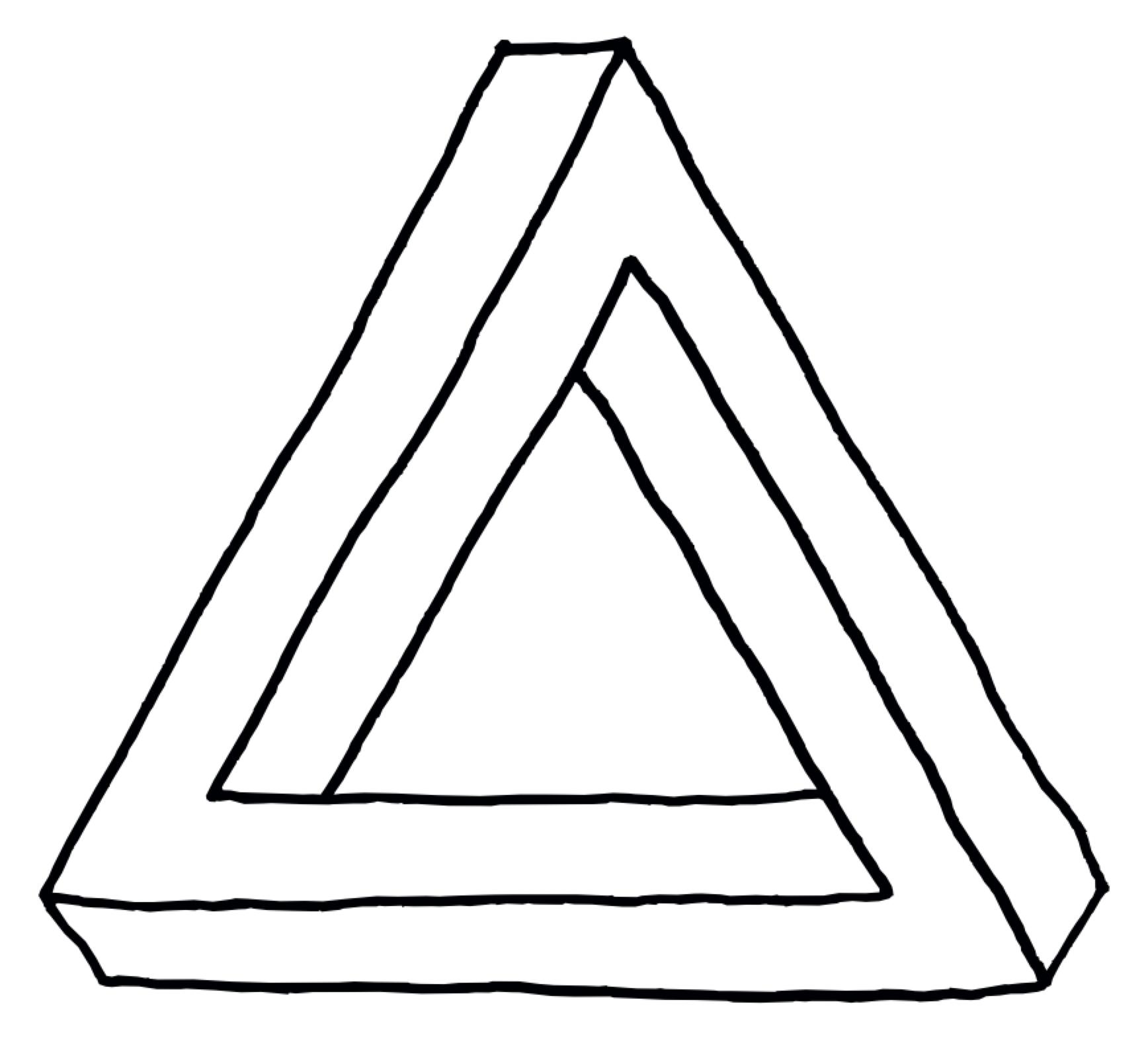
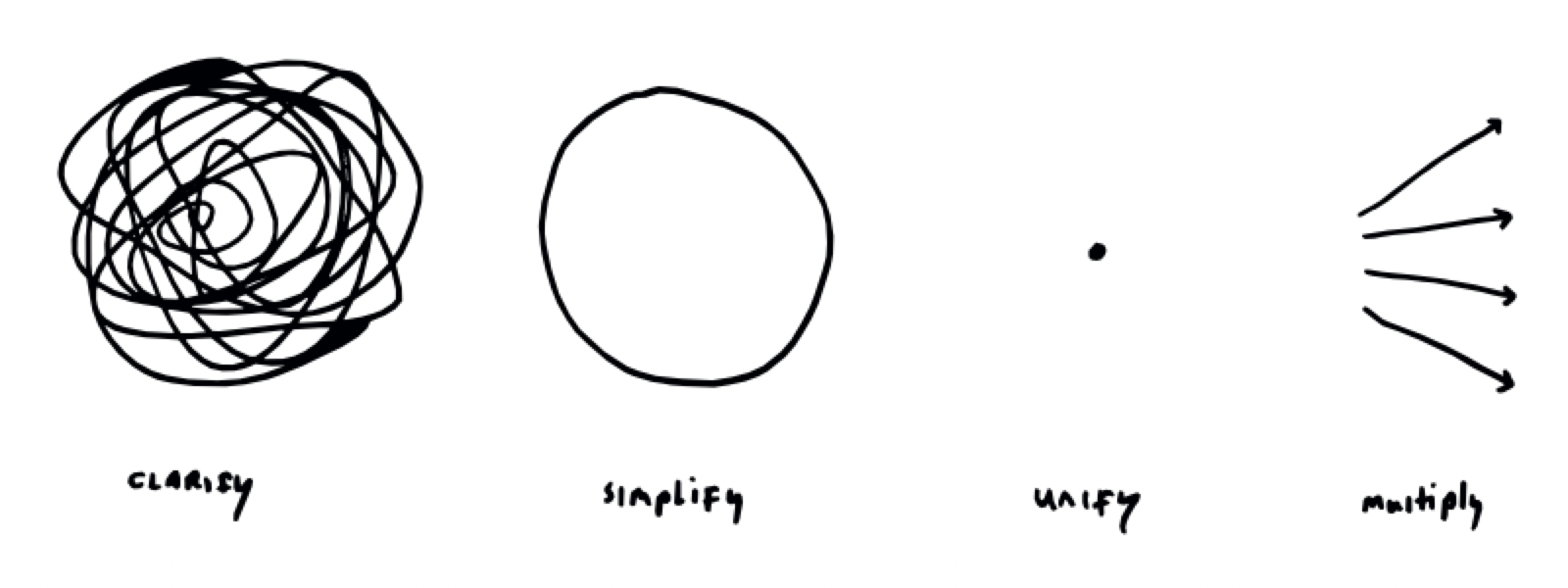
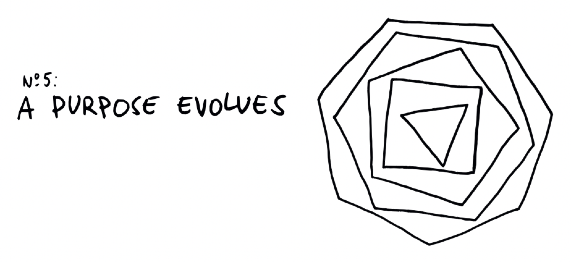
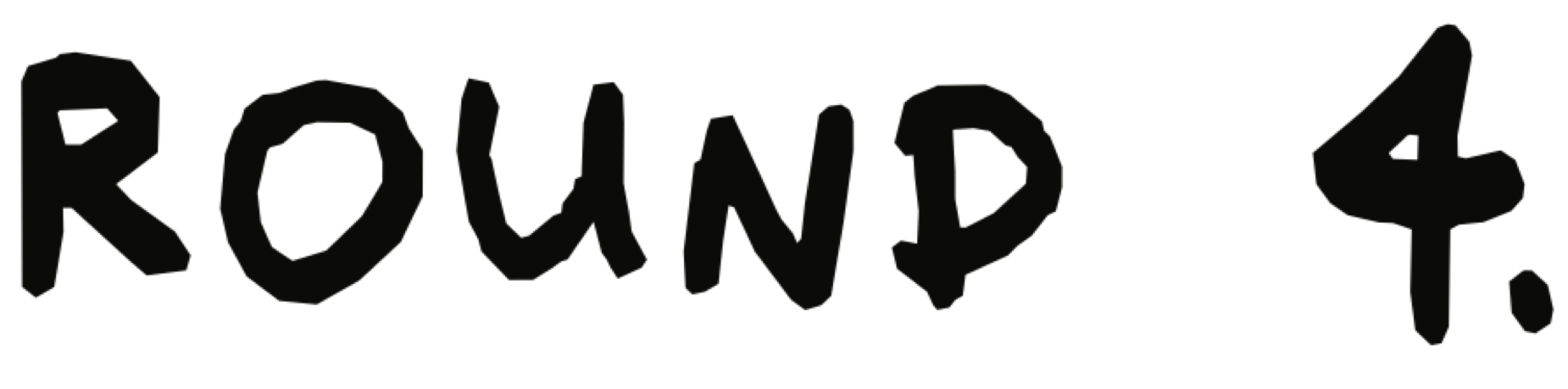
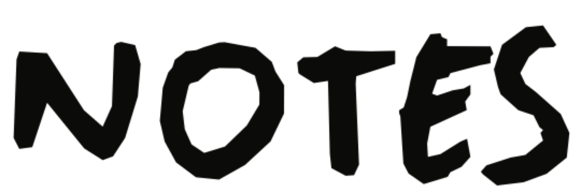
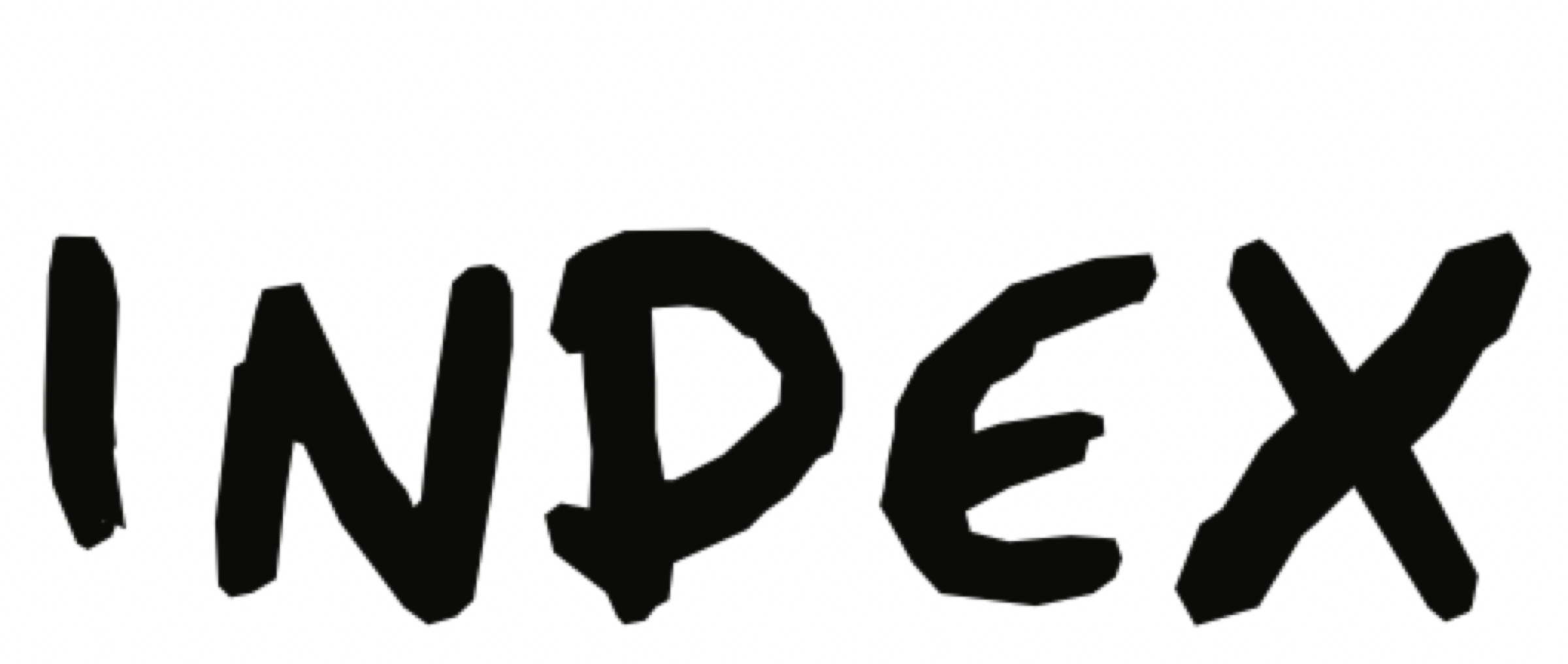
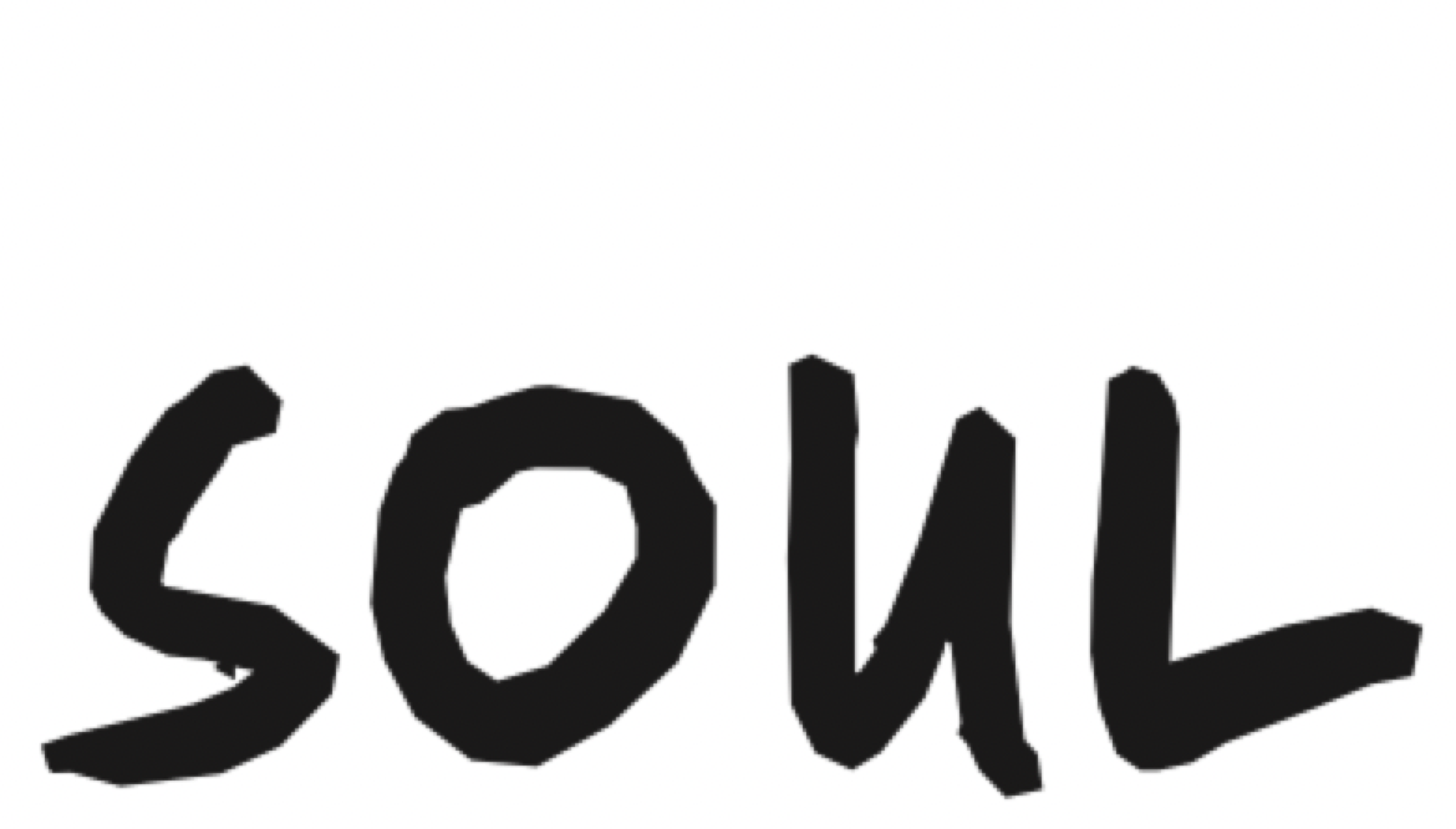
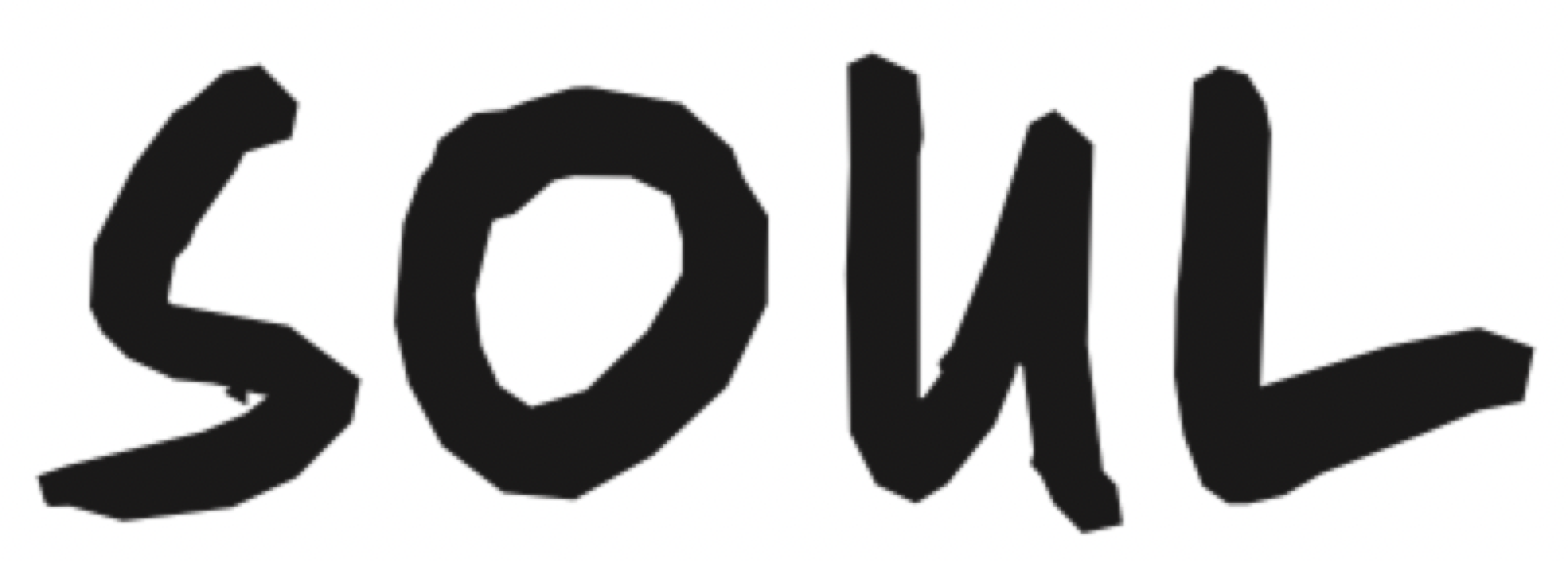
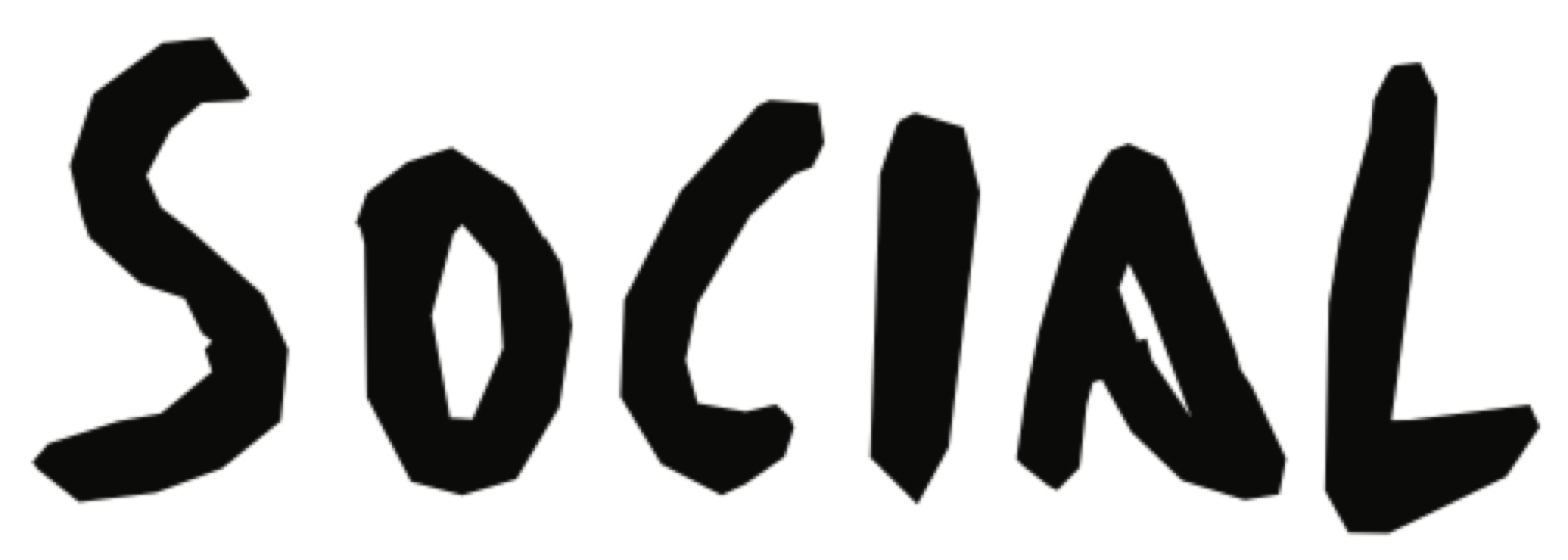
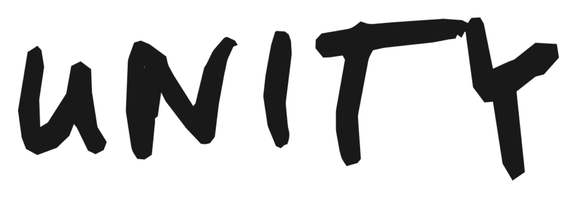
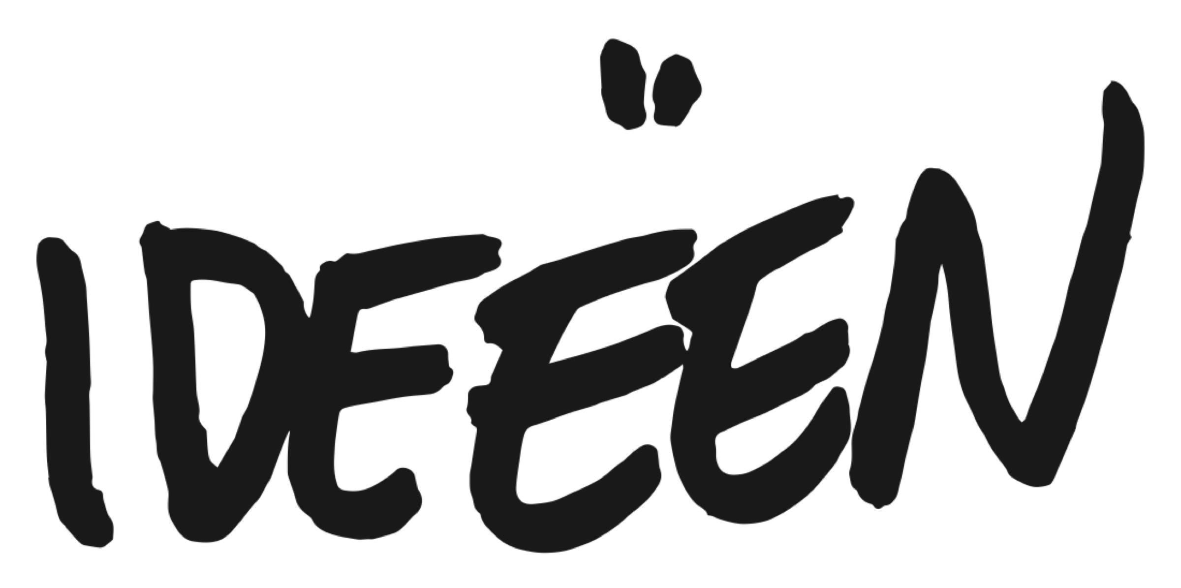
Lettering is drawn, word by word. Use the exact word, never a font.
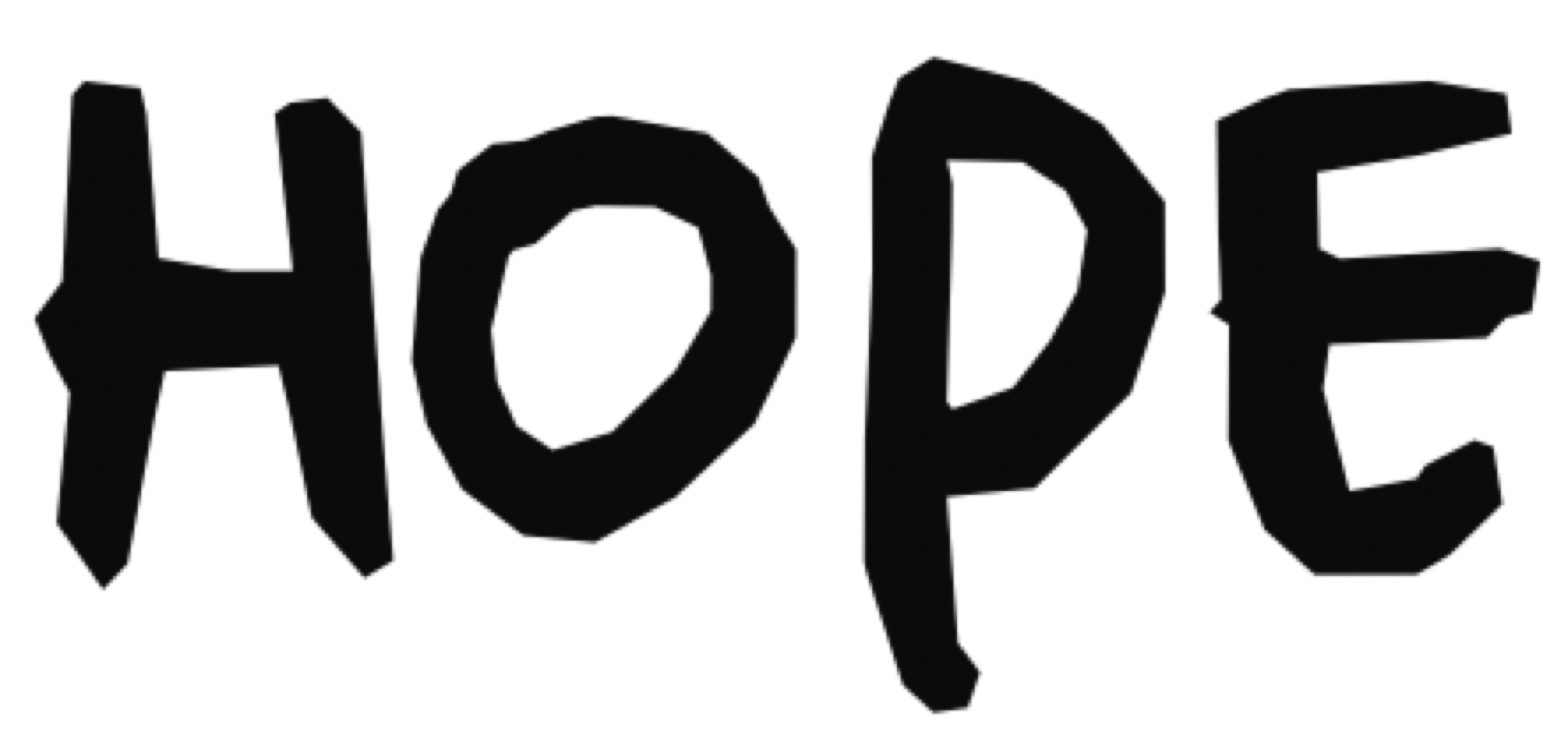
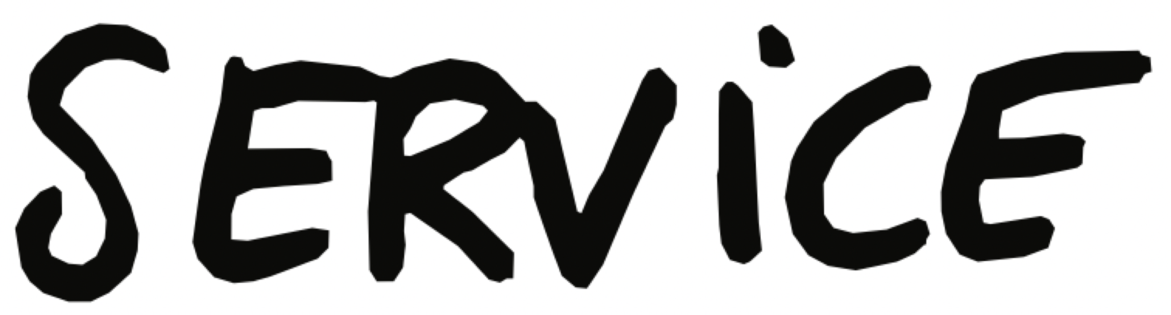
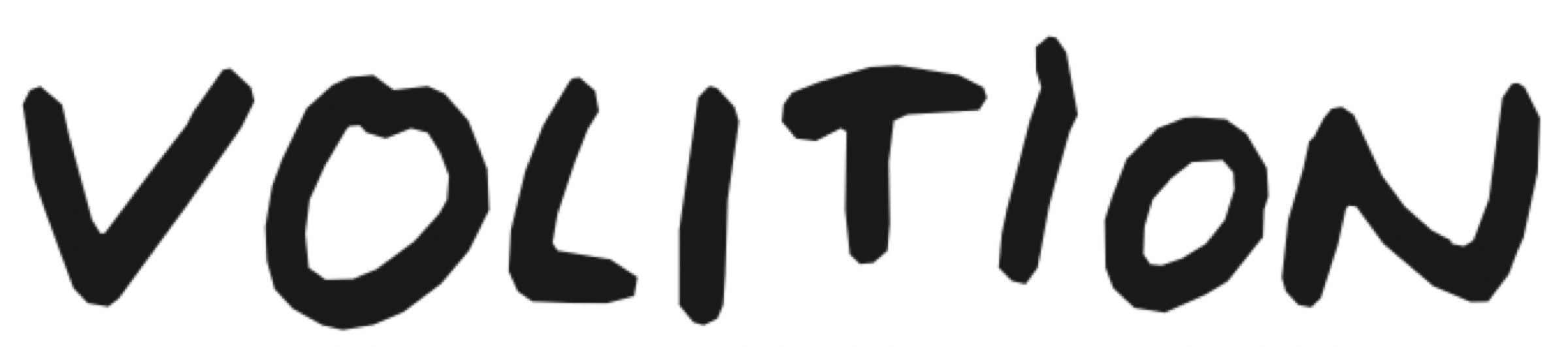
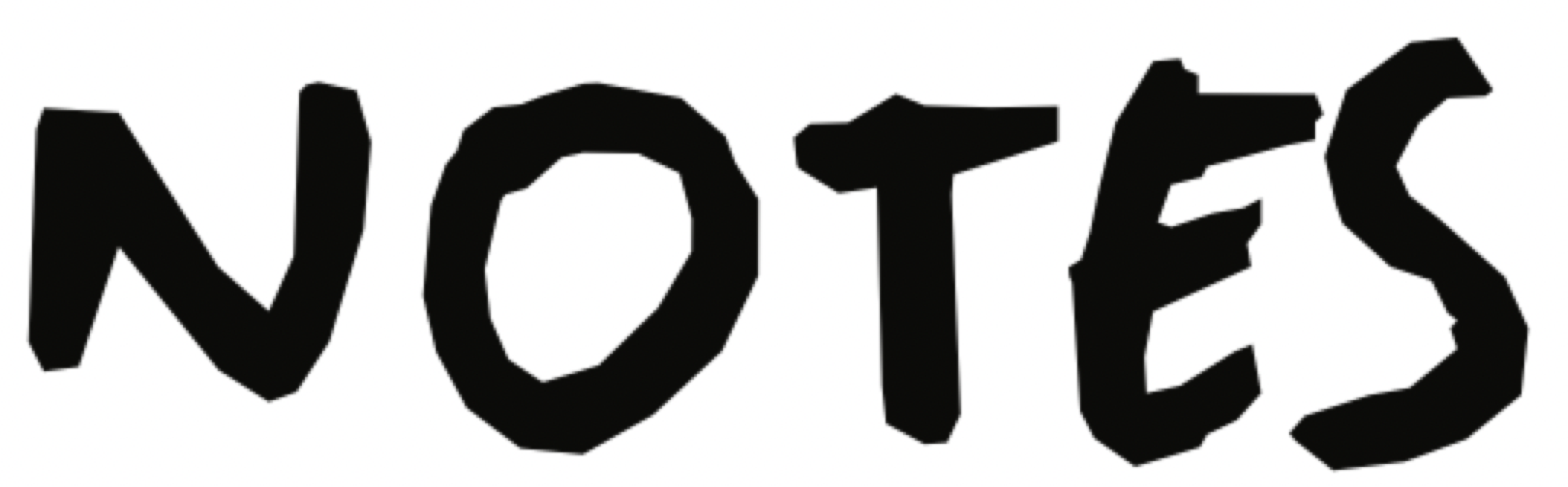
Every word and phrase below is cut exactly from the 2024 lettering sheet, in the order of the books. Scale proportionally only: never redraw, re-space or stretch a word, and never assemble a new word from letters out of others. A word that isn’t here gets drawn by hand and added. A ‘2’ is a second drawing of the same word from another book.
book 1
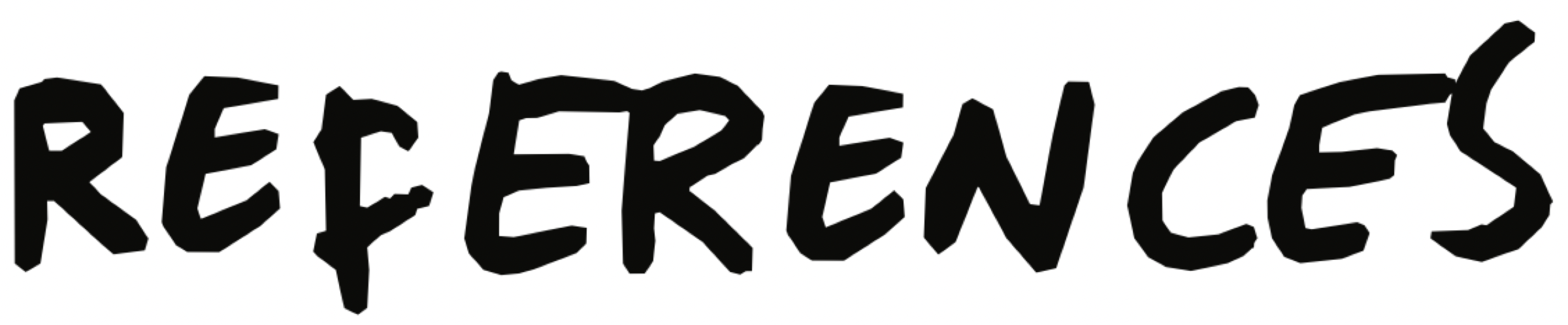
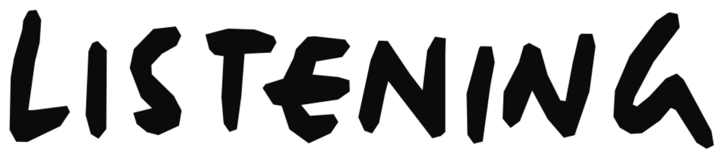
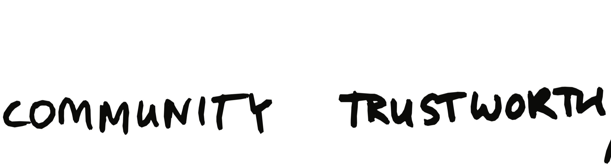
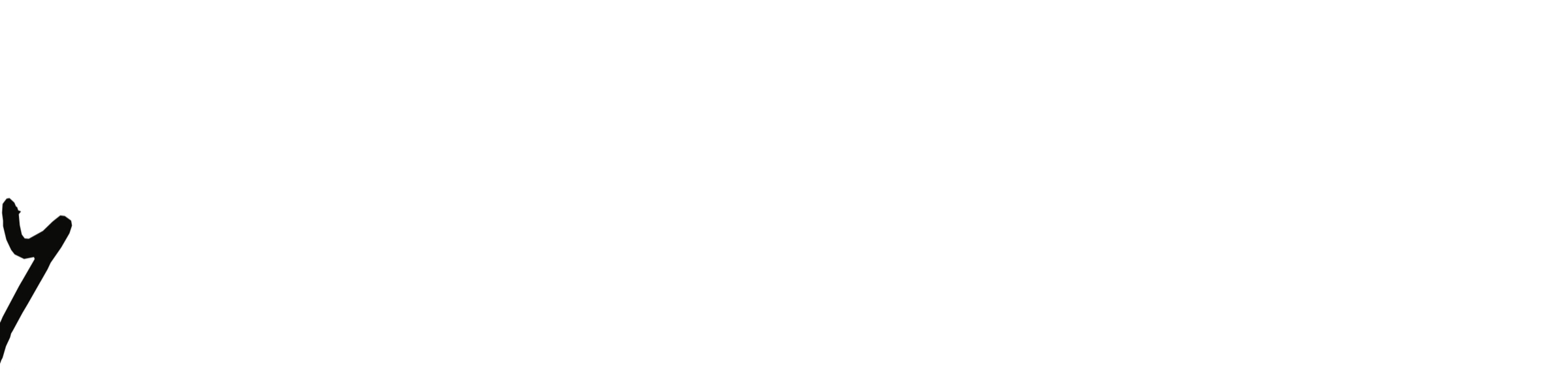
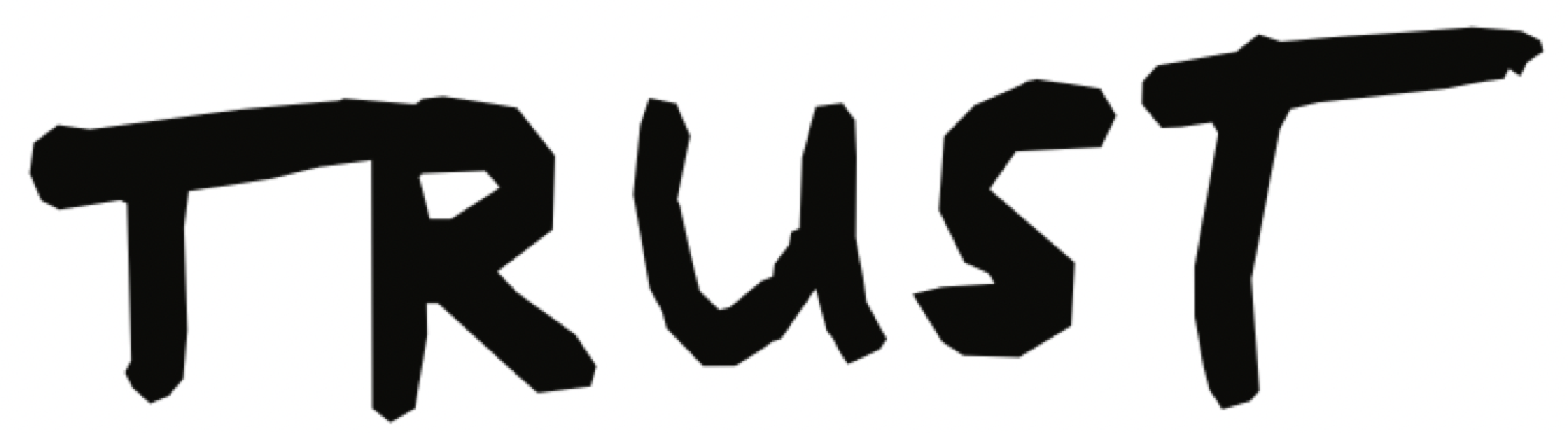

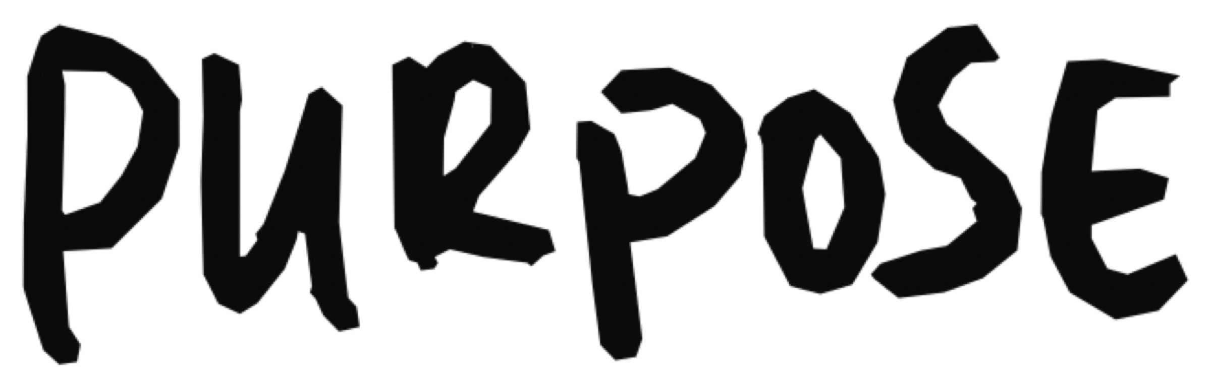


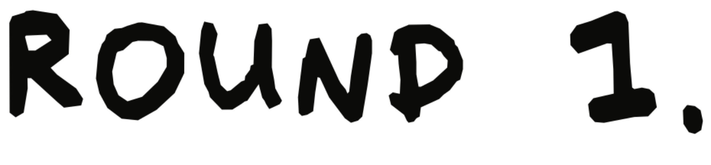

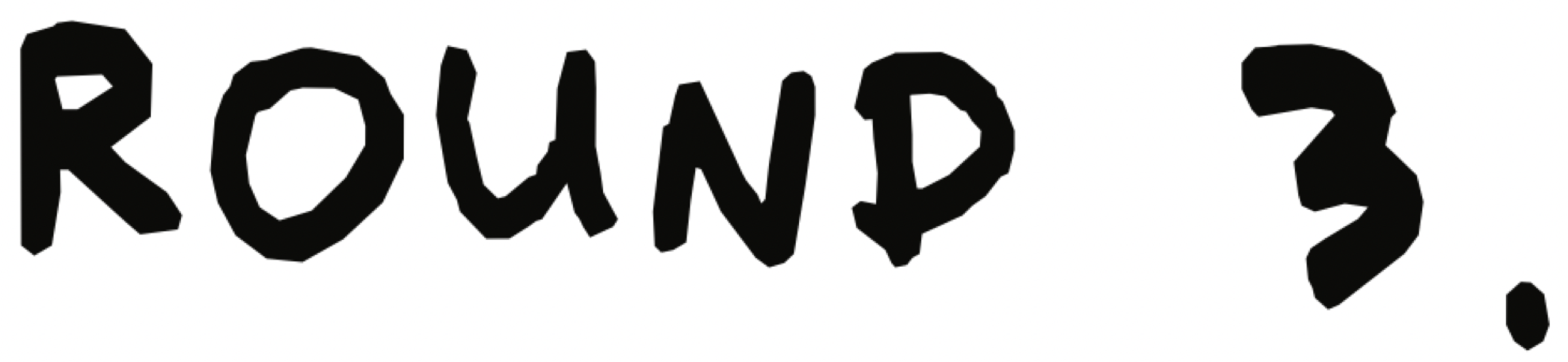
book 2




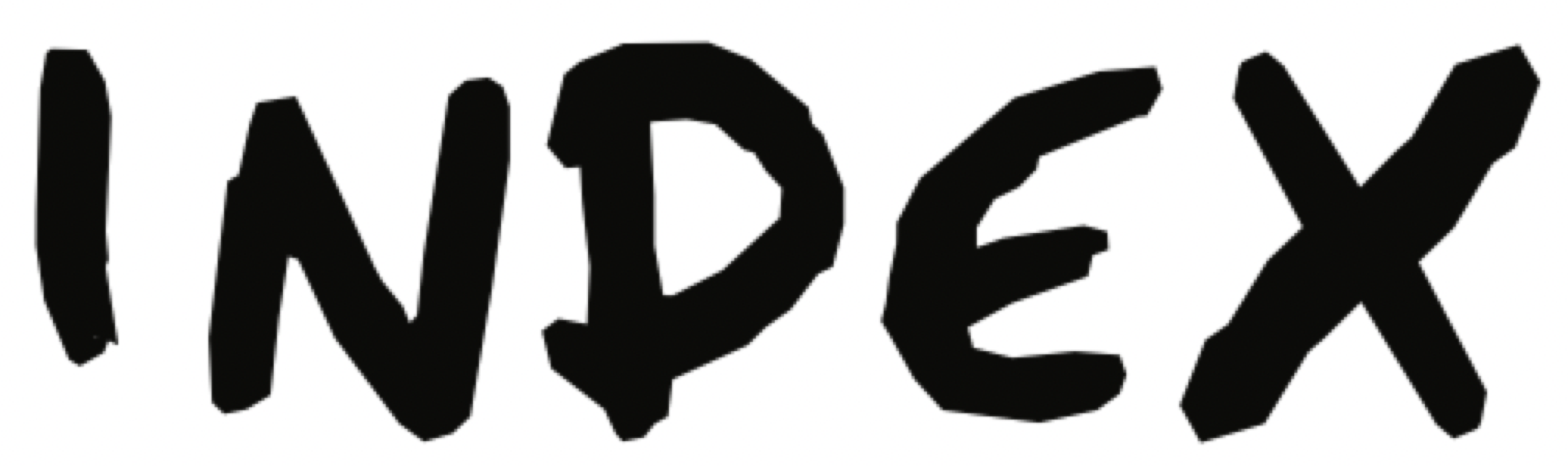
book 3, chapter 4
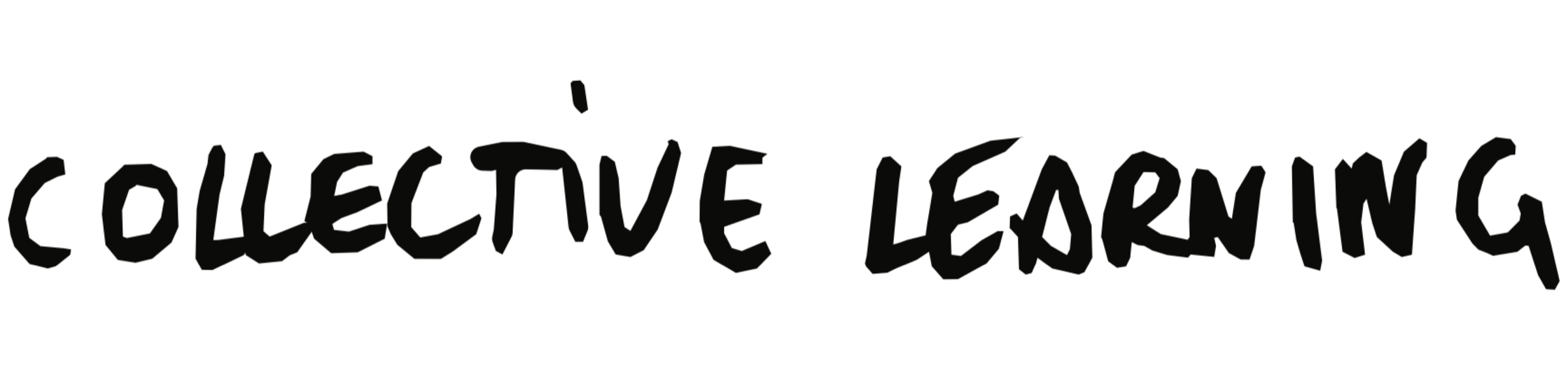





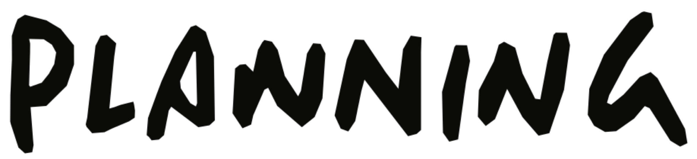
book 4, chapter 1
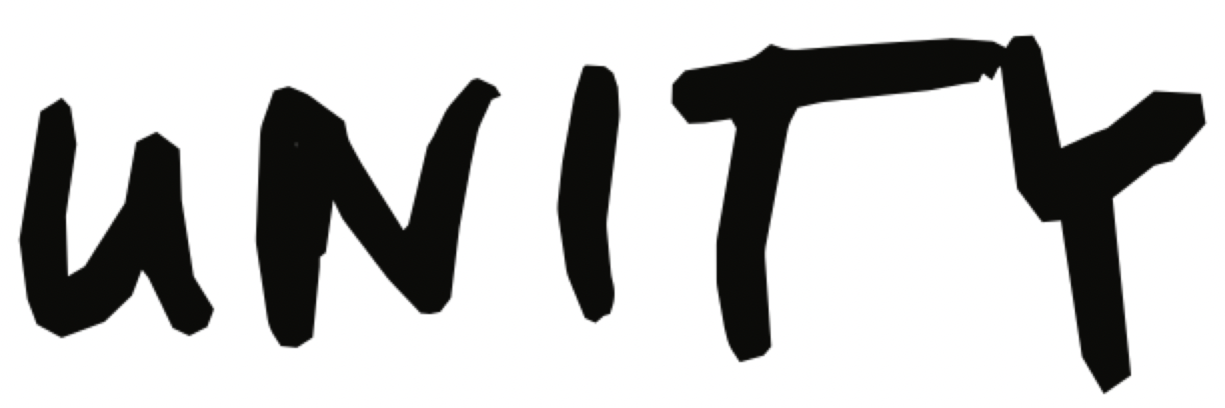






agents of change



display words
Real, quiet and observed: people standing in a circle under a tree, a stone balanced in mist, a city street. No stock poses, no filters. Full-bleed or square-cornered; type on a photo only in a label or in white on a calm area. One photograph per spread.
Lowercase links that move: get me there, introduce me, read more. The yellow button: square, 10/40/10/20 padding, underline on hover. The yellow + disc for 'go deeper'. Focus: a 2px solid ring with a 2px offset. Motion: fades at most, nothing bounces.
Text meets 4.5:1 on every ground it uses. Ink on yellow is 13.6:1. Excellence red (#ED1C24) is kept exact but fails 4.5:1 with both ink and white: only 24px and up on it. The website's grey-on-grey menu text fails contrast and is not carried into the system.
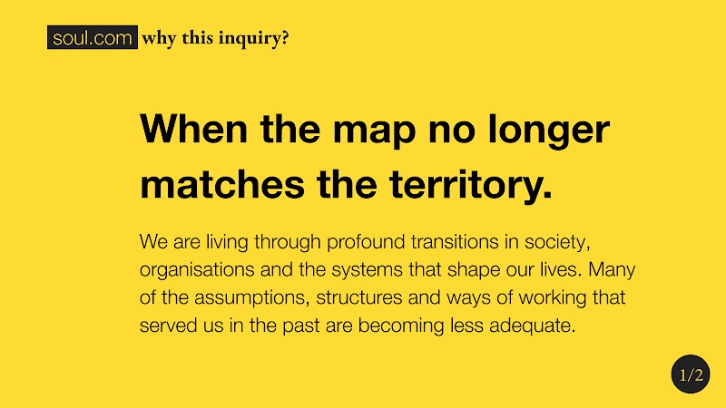
the statement slide
- header
- boxed soul.com 20 + EB Garamond Bold 20
- statement
- Helvetica Neue Bold 40, leading 55, sentence case
- body
- 20/28, asides 10 in brackets
- page
- EB Garamond 18 in an ink disc